Plotting with LaTeX Symbols
When making plots for publication, there is usually a need to add mathematical symbols in to the plots, either as axis labels or as the title. This is not difficult to do in all of my working languages.
Julia
In Julia, the LaTeXStrings package is the way to go. Below is a minimal example with the output. My reference is here.
using Plots, Distributions, Random, LaTeXStrings

Random.seed!(1234)
x = rand(Uniform(1, 10), 100)
y = 1 .+ 2 .* x .+ rand(Normal(0, 1), 100)

plot(size=(600, 600), dpi=100,
    legend=:topleft, title=L"y = \beta_0 + \beta_1 x")
scatter!(x, y, label=L"\textrm{Sample}",
    xformatter=:latex, yformatter=:latex)
plot!(1:10, 1 .+ 2 .* (1:10), lw=2, label=L"\textrm{True}")
xlabel!(L"x")
ylabel!(L"y")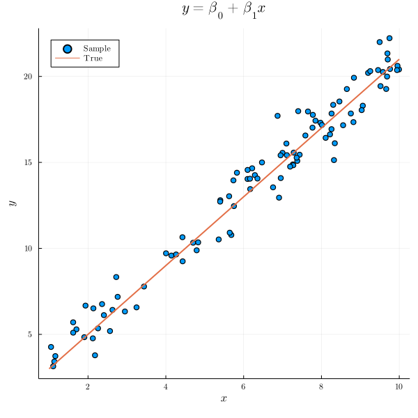
Python
In Python, we can modify the rcParam in the matplotlib package Below is a minimal example with the output, as documented here.
import numpy as np
import matplotlib.pyplot as plt

plt.rcParams.update({
    "text.usetex": True,
    "font.family": "sans-serif",
    "font.sans-serif": ["Helvetica"]})

x = np.random.uniform(low=1.0, high=10.0, size=100)
y = 1 + 2 * x + np.random.normal(loc=0.0, scale=1.0, size=100)

plt.figure(figsize=(6, 6), dpi=100)
plt.scatter(x, y, s=10, label=r"$\textrm{Sample}$")
plt.plot(np.arange(1, 11), 1 + 2 * np.arange(1, 11), color="red",
    label=r"$\textrm{Model}$")
plt.xlabel(r"$x$")
plt.ylabel(r"$y$")
plt.title(r"$y = \beta_0 + \beta_1 x$")
plt.legend(loc="upper left")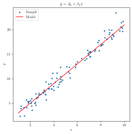
R
In R, the latex2exp package can be helpful for this task. Below is a minimal example and I have referred to here, as well as this page for dealing with subscripts and superscripts.
library(latex2exp)

x <- runif(100, 1, 10)
y <- 1 + 2 * x + rnorm(100, 0, 1)
beta <- TeX("\\beta")

plot(x, y,
    xlab = expression("x"), ylab = expression("y"),
    main = expression("y = " * beta[0] * "+" * beta[1] * "x")
)
lines(1:10, 1 + 2 * (1:10), col = "red")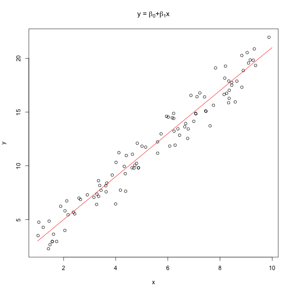
© Spark Tseung 2020-2023. Last modified: July 30, 2023.
Website built with Franklin.jl and the Julia programming language,
plus some help from LeXtudio.
Website built with Franklin.jl and the Julia programming language,
plus some help from LeXtudio.